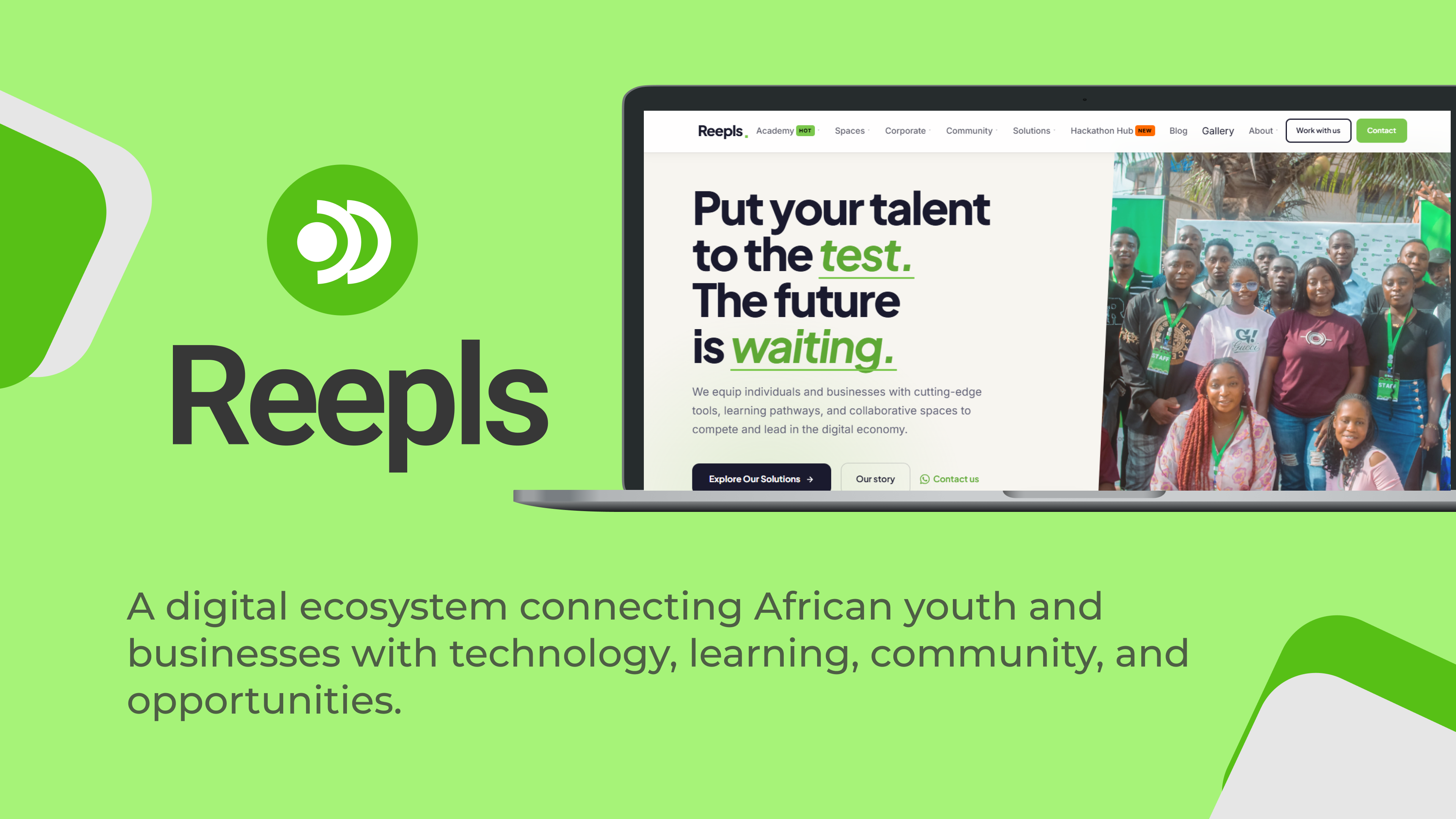
REEPLS
Designing clarity into a growing digital ecosystem.
Reepls brings together learning, community, spaces, products, events and opportunities. The challenge was not to remove anything, it was to give each visitor a clearer path into the ecosystem without forcing them to decode the entire structure first.
The platform had plenty of valuable content, but it was all competing for attention at the same time. Users were arriving with different goals, and the site was expecting them to understand the entire ecosystem before they could take a single meaningful step.
NOTHING FEELS IMPORTANT.
everything was visible, nothing was prioritized
visitors did not know which path best matched their need
the homepage asked users to learn the system before using it
Instead of treating programs, products, spaces and events as disconnected destinations, I organized them by the reasons people were arriving. This transformed the homepage from a content dump into a decision-making tool.
A visitor lands with a goal, not a roadmap.
The homepage narrows the decision to a few likely paths.
The user moves into the right ecosystem without friction.
The homepage speaks to user intent immediately instead of dumping everything at once.
Visitors can move from curiosity to relevance without friction.
The experience feels structured, generous and confident rather than crowded.