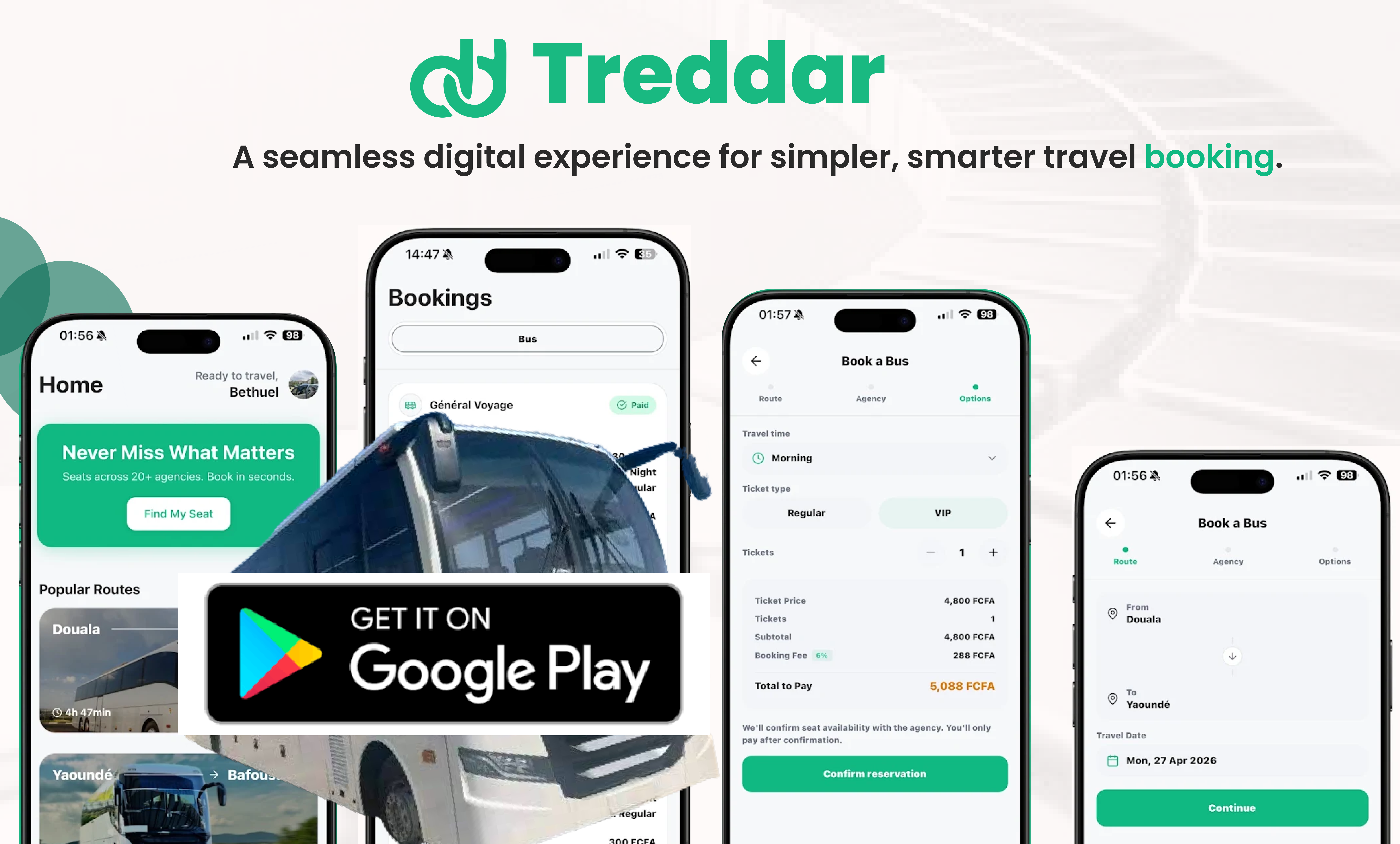
DESIGNING A SIMPLER WAY TO DISCOVER, COMPARE AND BOOK INTERCITY TRAVEL.
Turning a traditionally fragmented travel-planning experience into a clearer mobile journey.
Planning an intercity trip can involve more uncertainty than the journey itself.
A traveller needs to know which routes are available, which agencies operate them, when they leave, how much they cost, whether seats are available, and how to secure a booking. The problem isn’t necessarily a lack of options. It’s the effort required to turn those options into a confident decision.
Treddar brings the travel-booking journey into a digital experience where travellers can search for available trips, compare options, select a journey, complete a booking and receive a digital ticket.
The product capability is straightforward but valuable: it helps travellers find available seats, compare agencies, compare prices and departure times, book trips, receive digital tickets, and use mobile payment with English/French support. The design challenge was to make that process feel orderly rather than fragmented.
INTERCITY TRAVEL BOOKING
FEEL SIMPLE AND CERTAIN?
I wanted the experience to reduce the amount of mental work required before a traveller could commit to a trip. Instead of making people repeatedly search, compare and reconstruct information, the interface should progressively give them what they need to make the next decision.
Before thinking about individual screens, I broke the experience into the decisions a traveller actually needs to make. That gave me a much clearer way to think about the interface.
I designed around travel intent rather than demographics.

GOAL Plan ahead with confidence.
NEED CERTAINTY
PAIN POINT Unclear availability and scattered travel information make planning harder.

GOAL Find the best option for their priorities.
NEED COMPARISON
PAIN POINT Different agencies, prices and schedules can be difficult to evaluate together.

GOAL Find and secure a trip quickly.
NEED SPEED
PAIN POINT Last-minute travel creates greater uncertainty.

GOAL Book with less friction.
NEED SIMPLICITY
PAIN POINT Repeating information makes returning journeys feel unnecessarily long.
Travellers need to know what is actually possible before they can make a decision.
Showing options isn’t enough. The differences between them need to be immediately understandable.
Once a traveller has selected a route, the interface shouldn’t make them reconstruct that decision at every step.
After payment, the user needs an immediate and unmistakable confirmation.
The larger opportunity was bringing several moments of the travel decision into one coherent experience.
I intentionally kept the structure simple. The important question was not whether the screen looked finished; it was whether the user could understand the next decision with minimum effort.
The search experience needed to get out of the user’s way. The first question is simple: where are you going? So the interface gives route, date and passenger selection a clear priority.
The results screen is where the traveller moves from searching to deciding. That meant the information hierarchy mattered: agency, departure, arrival, price and availability. The card needed to make these differences scannable.
Before payment, users should have a final opportunity to verify what they’re booking. The interface needs to answer the last questions before commitment.
Once the traveller has made the decision, the interface should not introduce unnecessary complexity. Payment needed to feel like the last step, not another layer of uncertainty.
The booking ends with reassurance. The user needs to know the trip is confirmed and their details are ready to travel with.
The final experience is built around one continuous booking flow: search, results, details, payment and ticket confirmation. Mobile remains the hero because the product lives in real travel moments.
The visual identity needed to communicate travel, movement, confidence, energy and clarity. The design uses vibrant gradients, bold typography, route lines and ticket-inspired shapes to give the app a sense of forward motion without looking generic or over-engineered.
The user can begin with a route instead of navigating through complexity.
Trip information is structured around the decision.
The flow progressively carries context forward.
The digital ticket provides a clear endpoint.
Showing more options doesn’t automatically make a decision easier. The interface has to help users understand the differences between those options.
Every time the user has to stop and reconstruct information, the experience becomes heavier. Carrying context forward became one of the most important principles in my approach.
The moment after payment matters just as much as the moment before it. A user shouldn’t have to wonder whether the transaction worked.
Travel happens in real situations, while planning, waiting, moving or preparing to leave. That made clarity and speed particularly important.
IS THE ONE THAT LETS YOU
STOP THINKING ABOUT BOOKING.